ACSA.
Redesigned a non-profit website to enhance accessibility, helping newcomers easily find program information.

PROJECT oVERVIEW
ACSA is a non-profit organization that provides resources and services to vulnerable populations in the Scarborough area. The project prioritized accessibility and usability across the ACSA’s website, aiming to create a seamless, inclusive experience for newcomers with limited language proficiency.
MY CONTRIBUTION
Collaborating with two fellow designers and a project manager, I was responsible for interview script iteration, conducting user testing and competitor analysis, synthesizing insights, developing wireframes and refining prototypes.
mY ROLE
UX/UI Designer
tIMELINE
May 2022 - Aug 2022
TEAM
3 Designers, 1 Project Manager
tOOLS
Figma, Miro, Google Suite
KICKOFF
Getting to know the context
At the outset of the project we didn’t have a clear mission or specific goals for the project. Without pre-existing insights, our team kicked-off the project with an initial meeting with client to know about the user group of the website and align on the problem scope, projected timeline, and expectations.
/ THE PROBLEM
Users struggle to find information, leading to frustration and excessive calls
With more immigrants noticing the existence of the ACSA organization, they used ACSA's website for checking social program information, However, the website was not mobile responsive and many clients opted to call ACSA's phone line instead. This created a huge workload on ACSA's customer service staff and caused frustration for users.

The Goal
/ dISCOVERY
Understanding the current experience
We conducted five semi-structured interviews and online user tests with newcomers aged 28 to 45 years old. The goals of this research were to:
Discover the users’ main objectives when visiting the website, which will help define the main user paths
Explore the challenges they face when trying to achieve their goals
To organize the data we collected, I consolidated the information into an affinity map to identify emerging trends and pain points among our users.

/ RESEARCH fINDINGS
Challenges faced by users
The conversations with the current users validated their difficulties that have been mentioned by staff and the result of current website audit.
01
Not Mobile Responsive📱
The current website is not mobile-friendly. Users struggle to view and navigate content on their phones, which makes it frustrating to use on the go.
02
Poor Information Architecture 🏛️
03
Limited English Comprehension 🔤
Many users are newcomers to Canada with limited English proficiency. Heavy text content increases their cognitive load, making it harder to understand the site and complete tasks confidently.
04
Poor Searchability 🔎
Although the website contains a large amount of content, it lacks a search function. This makes it difficult for users to quickly find information—even when they know exactly what they’re looking for.
/ dEFINE AND SCROPE
Who are we redesigning for – immigrants with limited English proficiency
After going over user behaviors during our team meetings and reviewing the user stories from stakeholders, we created a persona to represent our target audience - newcomers with limited English proficiency. Since we only have 8 weeks, we decided to focus on Child & Family program – the most popular that users explore.

/ USER PATH
How does pooja discover information with the current interface
I also mapped out an experience map that outlines how pooja currently discovers information on the ACSA website. This helped me build empathy with my target users and to stay user-centred while identifying opportunity areas where I could intervene with my digital solution to create a seamless user journey.


/IDEATION 1
Conducting content audit and structuring new sitemap
I conducted an open card sorting test with users to learn users’ habits of going through the web navigation. According to the card sorting results, users feel frustrated when choosing between multiple navigation options and their focus in checking programs. Therefore, our team discussed with stakeholders to group similar options under the same tab.
/ sOLUTION 1
Simplified navigation bar to prioritize what users need

/ IDEATION 2 – mOBILE-FRIENDLY iNFORMATION DISPLAY
Getting inspiration from competitor analysis
The old website shows all the information in the form of links. For mobile users, it is hard to read a large load of text on a screen, especially for people who do not understand English proficently. The more text, the heavy cognitive load it can bring.
I conducted a competitor analysis and get inspired from other non-profit website to see how they how programs in a clear way and figured out Cards are the way to go!
/ sOLUTION 2
That’s when cards come in
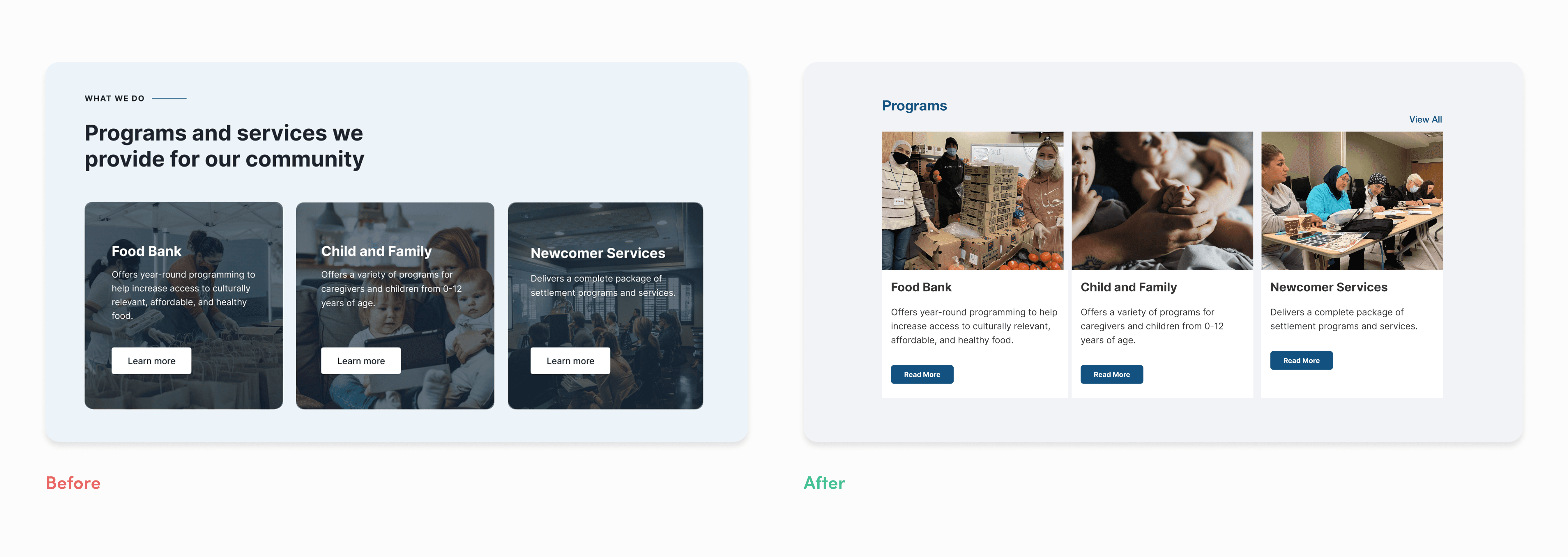
Cards present information in small, easy-to-digest pieces, helping newcomers avoid feeling overwhelmed. They make it easy to quickly scan program titles, short descriptions, and key details without needing to read everything closely. Cards also adapt well to mobile screens, keeping the layout clean and easy to navigate. By adding images, cards can make programs more visually appealing and encourage newcomers to explore more options.
ITERATIONS BASED ON TESTING
More accessible card display explorations
During testing, some users mentioned that the card component's background was too dark, making it difficult to read the text and see the images clearly. Based on this feedback, I made adjustments to improve readability and accessibility.
/ FINAL DESIGN
New mobile-friendly experience for users
After completing a mid-fi prototype, wireframe, and iterations, I was able to produce a high-fidelity prototype. The primary task flow is looking up information on the afterschool programs for children. The final solution maintains a simple and clean website by presenting program information in the form of cards. Users may quickly navigate to key information on desktop and mobile.


RESULT
What impact it brings
The task success rate of locating Child & Family program went from 20% to 80%!
/ RETROSPECTIVE
Reflecting my journey through this project
🧪 Test Quick and Often
Products don’t need to be perfect to begin testing. During the early stages of design, it’s more important to get feedback from user testing than to have a completed prototype. This way you can move forward and keep iterating. Rarely is the first prototype perfect, so I need to learn to let that idea go.
🕓 If I have more time…I will:
• Conduct additional user testing to validate and refine solutions.
• Expand scope to more user flows
• Create a design system to make the design consistent